
Google Analytics is an amazing tool that works exceptionally well when it comes to analyzing your website traffic and optimizing Google Ads. It provides you with detailed audience analysis, acquisition channel overview, and behavioral interaction. However, it misses several behavioral analysis features, like the ones present in heatmap tools.
When you are running a Google Ads campaign, the more data you collect and analyze, the better off you will be in the end. You need to go as deep as possible because that’s the only way you can optimize Google Ads. If you don’t know how visitors interact with your landing page, what elements they click, and where they spend most of the time, you’ll have minimal data to improve and optimize your landing page. This is what makes additional Google Ads tools like heatmap analytics tools a must-have for Google Ads optimization.
What is heatmap analytics, more exactly, though, and how can it help in Google Ads optimization? Let’s find out…
What Are Heatmap Analytics and How Do They Work?
Heatmap analytics is a type of behavioral analytics that visually shows you how visitors interact with a web page (or landing page). It tracks mouse movement to show you where visitors spend most of the time. It colors the webpage from red to blue (hot to cool) where red represents high engagement and blue represents least engagement.
Here is how a heatmap looks like:

The color coding for heatmaps tools might vary. In any case, the hot/warm colors represent areas where visitors spend the most time while cool colors represent the lowest engagement.
A heatmap tool like this can reveal a lot of useful data including:
- Areas of highest vs. lowest engagement
- Elements on a landing page where visitors click
- Scroll depth and time spent at each level (top, middle, and bottom) of the landing page
- Some heatmap tools also record visitor sessions in the form of a video clip.
In a nutshell, heatmap analytics show user behavior on a landing page and how visitors interact with your website.
And this data is collected by tracking mouse movement and click data. When you look at a heatmap report, you are looking at cursor movement and all the clicks.
Why Use Heatmap Analytics Tools?
If you are running Google Ads and not using a heatmap analytics tool, you’ll find it hard to optimize your landing page. Lack of data will force you to tweak your landing page based on a judgment which isn’t recommended.
The conventional analytics tool will tell you people aren’t converting but it doesn’t tell you why they’re not converting. A heatmap analytics tool collects data and tells you how visitors interact with your website. This is what makes it an essential analytics tool.
Here are the key reasons for using a heatmap analytics tool:
- It collects behavioral data that you don’t get with traditional analytics tools like Google Analytics
- You receive click data, cursor movement data, and hover data
- Using a heatmap analytics tool is very easy. All it requires is pasting the tracking code on your website
- It shows you how visitors interact and spend time on your website
- A heatmap tool shows you visual data that is exceptionally easy to understand.
How to Use Heatmap Analytics to Optimize Your Google Ads Landing Pages
One of the best ways, among several others, to optimize Google Ads landing pages is to use heatmap tools. It will provide you with actionable data highlighting areas that need improvement.
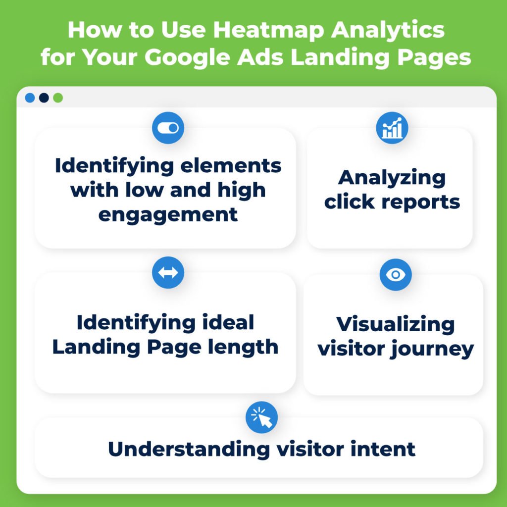
Here are the best ways to use heatmap analytics for Google Ads optimization:
Identify Elements with Low and High Engagement
Do you have high CTR but low conversions? It means there is something wrong with your landing page as people click your ad but don’t convert when they visit your landing page.
This happens to be one of the most common challenges that advertisers face. You keep sending traffic to your landing pages and they don’t convert. And things get worse when you can’t find the real culprit on the landing page that is ruining the conversion rate.
Enter the heatmap tool.
You can visually analyze your landing page and how visitors interact with it. It gets easier to identify low (and high) engagement areas on your landing page.
Here is an example:
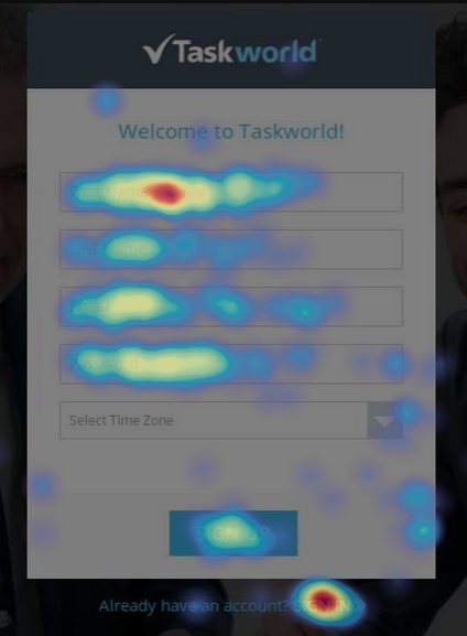
It shows visitors spend more time filling the form and around the signin link. The CTA is ignored leading to a decline in conversion rate. After removing the sign in link, improving form layout, and making CTA prominent, Taskworld increased conversions by 40%.
A heatmap tool visually highlights how visitors interact with your landing page. You can use this data to figure out where visitors spend most of the time. In other words, you’ll know what grabs their attention and what elements are ignored.
Analyze Click Report
Heatmap analytics provide you with click data known as clickmaps. It is a visual report of your landing page that highlights areas where visitors click. Here is how it looks like:
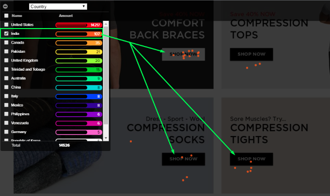
You can analyze the detailed click report of a landing page and filter clicks. You can see where people are clicking on your landing page other than CTA. If CTA is the most clicked button, it is fine. But if visitors click somewhere else, this means you have to either remove the link or button and improve the CTA button.
A click report provides you a lot of useful information about visitor behavior that you can use to optimize the Google Ads landing page:
- Where visitors click
- What type of buttons and links they like clicking
- Do they click buttons above the fold only or move down the page
- The most clicked element on your landing page and what makes it worth clicking.
Identify Ideal Landing Page Length
Heatmap tools also show scrollmaps, which are visual scrolling reports. It helps you see how deep visitors scroll. Here is what a scrollmap report looks like:
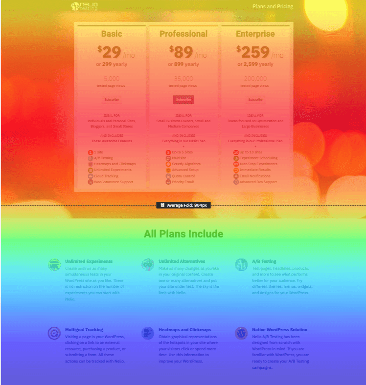
You can use this report to see how deep visitors scroll, what elements they’re more interested in during scrolling, and how much time they spend above the fold.
The best part: Scrollmap helps you determine the ideal length of your Google Ads landing page. If a lot of visitors don’t scroll past above the fold, you must keep your landing page short.
You can also optimize CTA and form using scrollmap. The most-read area of the landing page is where the CTA and form must go as it is the most viewed section on the landing page.
Visualize Visitor Journey
A lot of heatmap tools provide you with a session recording feature. It is an advanced feature so you might not get it with all the heatmap tools. Session recording is a video clip of the visitor session that is recorded. You can view how visitors use and interact with your landing page via a video clip. It includes end-to-end sessions including clicks, scrolls, mouse movement, and everything else.
If you need to fully understand the visitor journey and conversion journey, this is the best report to look at. You can use it to optimize your landing page for the best user experience.
Session recordings provide you with the best explanation of how visitors interact with your landing page. Visualizing the complete visitor journey helps you identify friction areas, visual path visitors follow, how they reach the CTA button, and much more.
Optimization and A/B testing become much more meaningful with session recordings.
Understanding Visitor Intent
Intent optimization is a major part of Google Ads optimization. You must understand the searcher’s intent to better serve visitor needs and to improve UX.
Intent optimization is all about post-click analysis which involves visitor’s interaction with your landing page. A heatmap tool is the best way to conduct detailed post-click analysis and monitor time spent on the landing page, engagement, scrollmap, and more.
Based on this post-click analysis via heatmap tool, you can optimize the Google Ads landing page and also find fraudulent traffic, locations, and devices. For example, if traffic from a specific location isn’t converting well (according to post-click analysis), you can block it.
Similarly, you can use tools like ClickGUARD to make sure you aren’t paying for fraudulent clicks and that you’re getting quality traffic from your Google Ads.
So, a heatmap tool will help you optimize the Google Ads landing page for searcher intent and it will also help you identify loopholes in the traffic you are receiving.
Using a reliable and sophisticated heatmap tool is essential if you want to optimize Google Ads and your landing pages. It will provide you with lots of data that you don’t get with any other analytics tool. And the data from the heatmap analytics tool isn’t just limited to Google Ads, you can use it to improve buyer personas, create targeted marketing campaigns, and more.
Think strategically.
It helps you better understand your ideal customer, and there is nothing more important than understanding your target audience if you want to improve Google Ads ROI and ROAS.